Updated: Everything Wrong with Dolby Speaker Layout Diagrams
I’ll be honest, nothing drives me as crazy as all the things wrong with Dolby speaker layout diagrams. It isn’t so much that they are incorrect, as they are unhelpful. Dolby should be setting the standard for these diagrams. You should be able to use them as a blueprint for how to set up your speakers. But instead, I spend more time than I should trying to convince people that, even though that’s the way it looks in the diagram, that’s not what Dolby meant. So, here are all the things wrong with Dolby’s speaker layout diagrams.
Update 12/28/2021: A cleaver reader (thanks James) found some old diagrams from Dolby that were much better. I’ve included them at the end.
Unrealistic Room Size
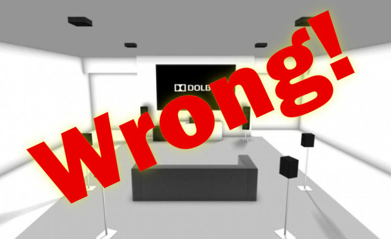
Take a look at this room:
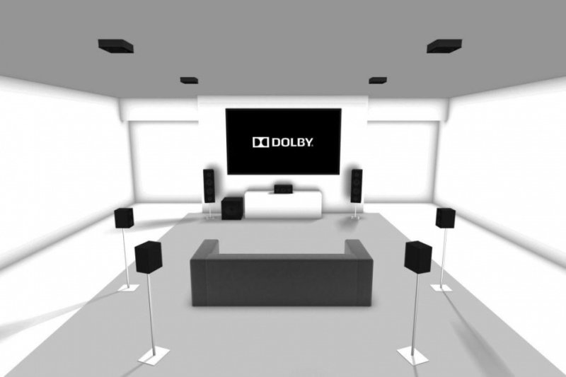
That room is about twenty feet tall. Maybe taller. How many of us are rocking ceilings that high? I’d venture not too many. Now notice all the room around the speakers. There is a small couch (loveseat really) that looks like it is 10-15 feet from the screen and there is at least five feet outside of any speaker. Plus, the speakers are all on stands just out in the middle of the room. If you are single, you might be able to get away with this setup. But if you have a partner, a pet, or a child, this is a recipe for disaster.
Aiming Speakers At One Seat
This is the really big problem with these diagrams. Most people take one look at the Dolby speaker layouts and immediately copy (wrongly) what they see in the diagrams. They don’t really read the angles or even the accompanying text. They just look at the diagram and try to mimic that in their rooms.
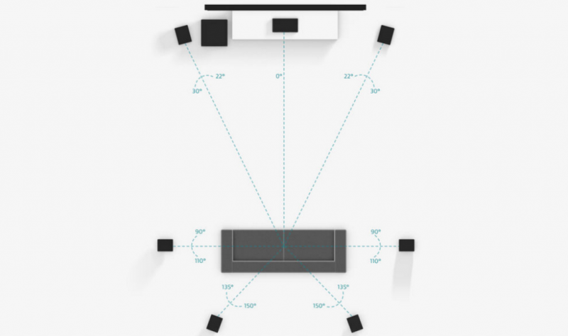
Let’s just put this plainly: Almost NO speaker was designed to be pointed directly at the center of the couch. Almost none. If this were the “best” orientation for a speaker, only the one person sitting in the center would get the “good” surround sound. Most speakers are meant to be experienced off-axis. This gives the speaker the ability to create a large sweet spot that can encompass an entire couch.
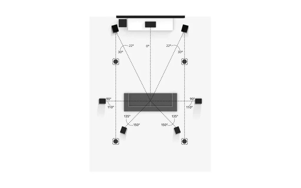
But Dolby consistently sends people down the wrong path by showing layouts of each speaker in their diagrams so that they are pointed directly at the center seat. This is neither helpful nor correct. It would be better if they showed each speaker pointed directly into the room. That orientation is more often correct than having every speaker pointed at the center of the couch.
Subwoofer Placement
In all three of the speaker layout diagrams above, Dolby has placed the subwoofer in what is almost assuredly the wrong location. The subwoofer is always placed at the front of the room, just to the left of the screen, between the screen and the front left speaker. While this might be a perfectly fine location for some people, it is by no means the best location in every setup.
I’d like to see Dolby add a disclaimer. They need to state somewhere on their diagrams that subwoofers should be placed based on their performance in the room (which is fairly easy to determine by users). What they do now is suggest that all rooms should be set up by professionals. That’s a cop-out and a lame one at that. Few people actually have professionals set up their speakers and why should they? It isn’t hard to do (if you don’t provide misleading diagrams) and costs nothing but time. But what would really solve this problem is:
Lack of Dual Subwoofers
How about Dolby gets on the dual subwoofer train already? It’s been a well-established fact that, in most rooms, dual subwoofers provide a more even bass experience for everyone. Plus, while they are depicting an unrealistic room, you might as well make it an enclosed rectangle. Then, placing two subwoofers is easy. Put one in opposing corners or the midpoints of opposing walls, and you are done. Not only will your speaker layout diagrams no longer be wrong Dolby, but you can show people exactly how to set up dual subwoofers properly. How hard is that?
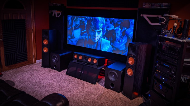
Dolby Has Never Seen a Couch
The most laughable aspect of the Dolby speaker layout diagrams is just how wrong they are about couches. Take a glance at Diagram 1 up there. The surround speakers are all at ear level. They are just as tall as the front speakers. This means that Dolby not only thinks you’ll always be sitting in the center of your loveseat (because that sounds comfortable), but also that you sit on a very strange couch. How strange? This strange:
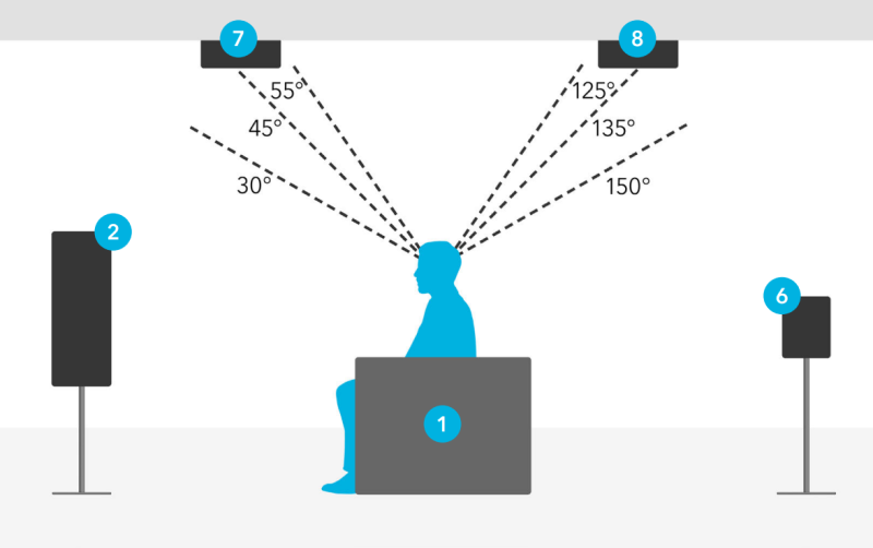
This is from Dolby’s Atmos speaker placement PDF (LINK). In real life, people like to have their backs and heads supported when they sit. In an actual room, the surround back speaker (#6) would be firing into the back of the couch and the front speaker would be too high. This goes for all the rest of the floor-level surround speakers. This is why we recommend elevating them a little so that each speaker has a clear line of sight of each ear on the couch.
In fact, if you place your side surround speakers as they do in Diagrams 2 and 3, anyone sitting next to you would be blocking the information from the side surrounds. So, not only do you have to sit up like some weirdo on a couch with a back barely higher than your waist, you have to do it alone. Which, honestly, if this is how you sit, you probably are alone.
The Screen Size is Laughably Small
My last qualm is certainly more of a nitpick. Dolby is trying to show you (very wrongly) how to set up your speakers with their speaker layout diagrams. The display is really there just to let you know where the front of the room is. I get that. But does it have to be so small? Based on my armchair calculations, the screen shown in each of these diagrams is about 65″ diagonal. That’s not tiny but it is when you are sitting (what looks to be) around 15 feet away. This gives you an 18 degree Field of View. That’s far too small and very much less than any of the recommendations you’d get from THX (at least 36 degrees) or SMPTE (at least 30 degrees). While it may be realistic for how people are (depressingly) actually setting up their rooms, we are going for a cinematic experience here. Dolby would either have to make the couch (and screen) wider or shorten the distance to the current screen to show the proper Field of View.
The Wrap Up
I’m sure there is a reason Dolby did the things they did with their speaker layout diagrams. Probably because they are trying to be as clear as possible for the neophyte. But in their effort to be clearer (if that is what it is), they’ve also become wronger. A quick peruse of any home theater forum or subreddit will exhibit picture after picture of people trying to replicate what Dolby has shown. Are they getting surround sound? Yes. But could their systems sound better if their speaker placement was different? Also yes. Come on Dolby. You can do better.
Did we miss anything? Let us know in the comments below!
Update 12/28/2021
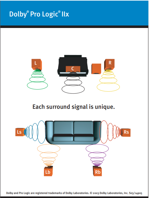
A cleaver reader James has dug up some old diagrams from Dolby. These were from long before Atmos and show speakers placed in positions that are more accurate. Check them out:
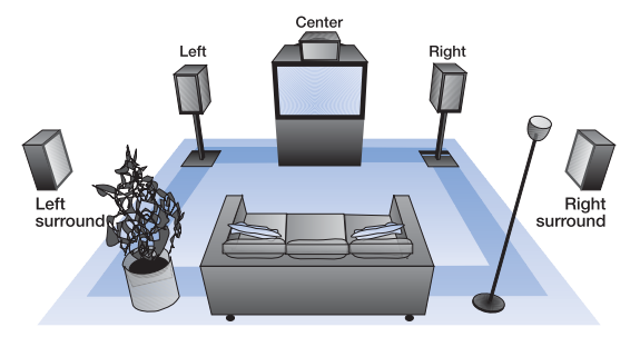
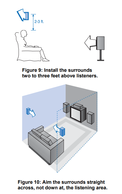
While these aren’t the most exciting diagrams, they more accurately show how speakers should be set up. The speakers are firing into the room and not angled at the listener. Surround speakers are slightly elevated. The 7.1 diagram even has the surround back speakers very close to where we’d place them in an Atmos setup. These are much better diagrams. Thanks again James!




You should provide your own diagrams.
Not a bad point.
For years, Dolby’s recommendations were to raise surround speakers to 1 to 3 feet above ear height and to point all speakers directly into the room (not angled towards the primary listening position).
Sadly, there’s no archive on the Dolby website and it’s impossible to find anything other than the current recommendations which changed in 2010.
Marketing got a hold of the website and mucked it all up and where the confusion comes into play. Everyone should be using the official guide directly from Dolby Engineering https://www.dolby.com/siteassets/technologies/dolby-atmos/atmos-installation-guidelines-121318_r3.1.pdf
I would not be surprised if that were true. Too often there is a disconnect between the engineering and marketing departments!
The PDF you link is better, but the updated images (from the old recommendations) are better still. While if you look closely at the diagrams in the PDF the speakers aren’t pointed directly at the listener, there are still lines drawn directly to the center of the couch from each speaker. Some of the images I use above are from that PDF. This article was inspired by seeing picture after picture posted on places like Reddit of people’s setups where every speaker is pointed directly at the center of the couch. It just isn’t the way to get the widest sweetspot and not how Dolby really wants you to place your speakers.
Sorry, I agree with you and thought I’d share this to r/hometheater… It didn’t go so well and got myself banned in the process. Keep up the great podcast from a longtime patron supporter.
Wow, that’s not very friendly. Well, thank you for the support.
Hey Tom,
I don’t think you wanted to call James a “cleaver reader” in the update section…unless he’s a butcher…which would then make sense.
In all seriousness, thank you for the articles and the podcast; they are very helpful and inject a heavy dose of common sense into an industry desperately in need of it.
Take it easy,
Still Not Your Podcast Partner
It seems like all these speaker placement plans are for one person to enjoy the effect. i believe most people when they invite friends over to enjoy a movie, they want all to enjoy the sound. Lets design it for all to enjoy. When we go to a theater we don’t have to set in a particular seat to enjoy the sound effects..
I would argue that pointing all the speakers at one seat won’t give you the sound full stop. Many speakers are designed to be heard off-axis. Pointing them directly toward you was never their intended orientation and will often result in accentuated treble and non-linear response.